

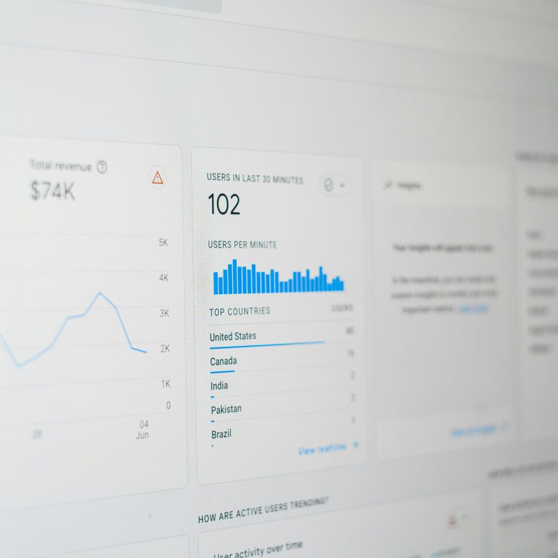
A three-week deadline forced hard tradeoffs on a dashboard redesign — here’s what shipped, what got cut, and what I’d change next time.
When a client came to us with a dashboard redesign and a three-week deadline, the first instinct was to say no. Instead, we said yes — with conditions.
1. Scope the MVP ruthlessly. We cut the redesign down to the three screens users touched daily: the overview, the reports table, and settings. Everything else stayed as-is for a later phase.
2. Reuse before you rebuild. Rather than designing new components from scratch, we audited the existing design system and kept anything that already worked. Half the “redesign” ended up being better spacing and hierarchy, not new UI.
3. Get feedback in days, not weeks. We shared low-fidelity Figma prototypes with three real users by day four. Their confusion pointed straight at the data table — which became the actual focus of the remaining two weeks.
4. Ship with known gaps. We launched without dark mode support, clearly flagged as a fast-follow. Perfect was never on the table; working, on time, was.
5. Document the cut list. Every deferred feature got written down with a reason. Six weeks later, that list became the roadmap for phase two — no memory required.
Tight deadlines don’t have to mean bad work. They just mean deciding, early and honestly, what actually matters.

Leave a Reply